Improving usability & site navigation for users
CLIENT/TIMELINE
Cal Student Central, 7 months (2020)
MY ROLE
Lead UX Researcher (information architecture, usability testing, user interviews, survey design, user personas, sitemap design, card sorting)
TEAM
Matthew Sun (Project Manager), Naho Yoshida (Web Designer), Rita Goldberg (Content Writer)
TOOLS
Figma, Lucidchart, Asana
Overview
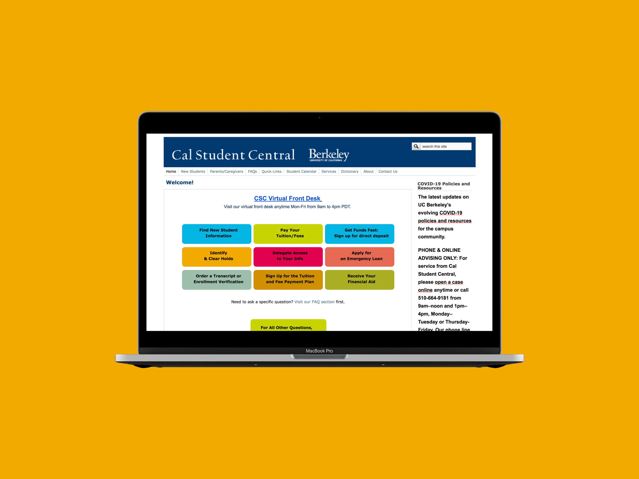
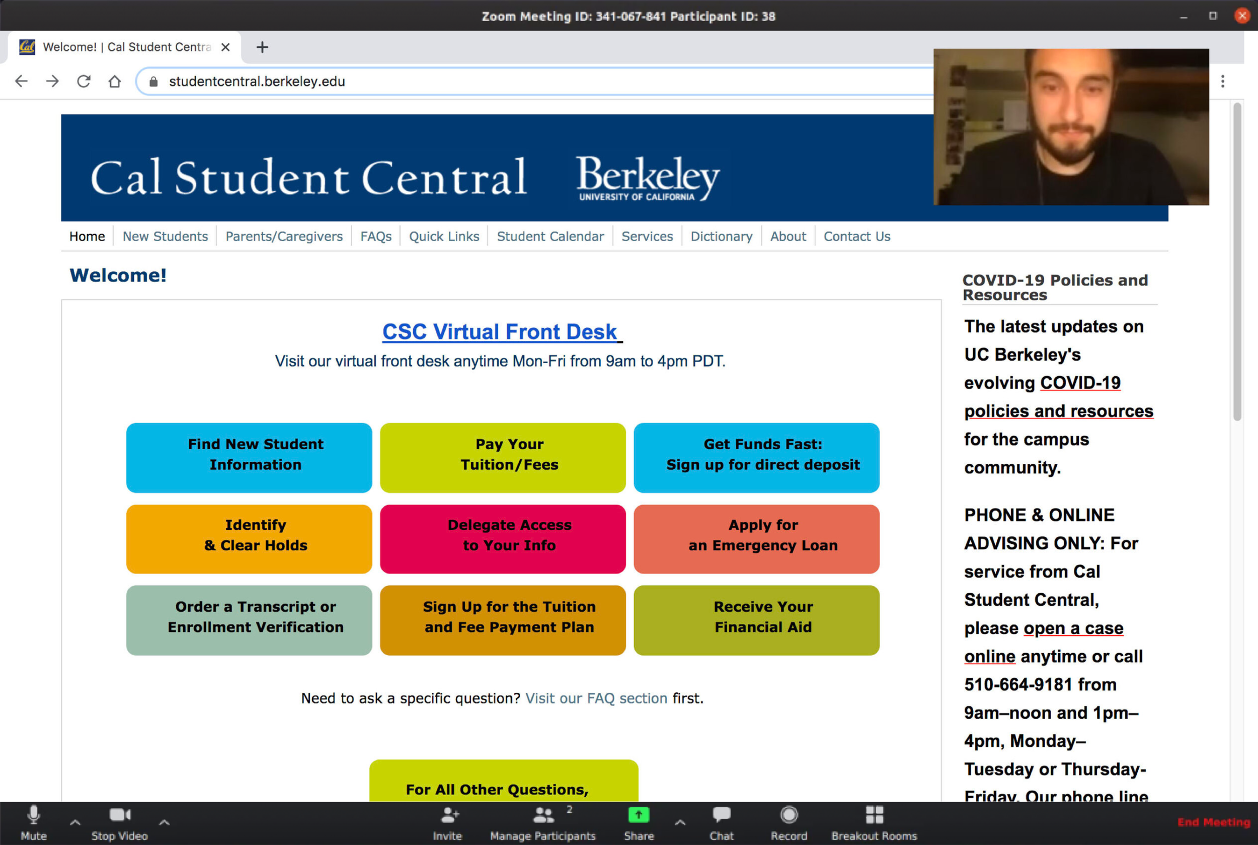
Cal Student Central (CSC) is the primary financial and academic service at UC Berkeley. They offer services online, over the phone, and in person.
Problem
During the COVID-19 pandemic, UC Berkeley students relied heavily on Cal Student Central’s website for information. However, given the cluttered site navigation, many users experienced confusion and stress when trying to navigate the website. The lack of clarity around navigation led to a high volume of case openings and calls, constraining staff bandwidth heavily.
Goals
Our goals were to improve website navigation, increase user confidence in brand identity, and increase client satisfaction.
Outcome
After applying recommendations from our user research to the website redesign, task efficiency increased by 45%, client satisfaction increased by 60%, and user satisfaction increased by 80%.
Developing a research plan
At the start of our project, we established 2 research goals:
Discover user pain points from using CSC’s website
Suggest data-driven recommendations to improve website navigation
To understand users’ behaviors and interactions, I analyzed data reports from Google Analytics and saw that users visit CSC’s website to perform 4 main tasks:

Open a case

Find financial aid forms

Learn about withdrawal

View the student calendar
As I prepared to write a usability testing guide, this data provided us with a user-centered perspective. Moreover, I tailored questions and tasks to allow us to observe how users approached navigating the site’s most popular functions.
Identifying user pain points
To test site functions and measure how users performed tasks, I conducted 1-on-1 remote usability testing sessions with 7 students. I recruited participants through Facebook groups and used university funding to offer participants gift cards in exchange for their time.
After synthesizing our research data, we discovered 4 key pain points:

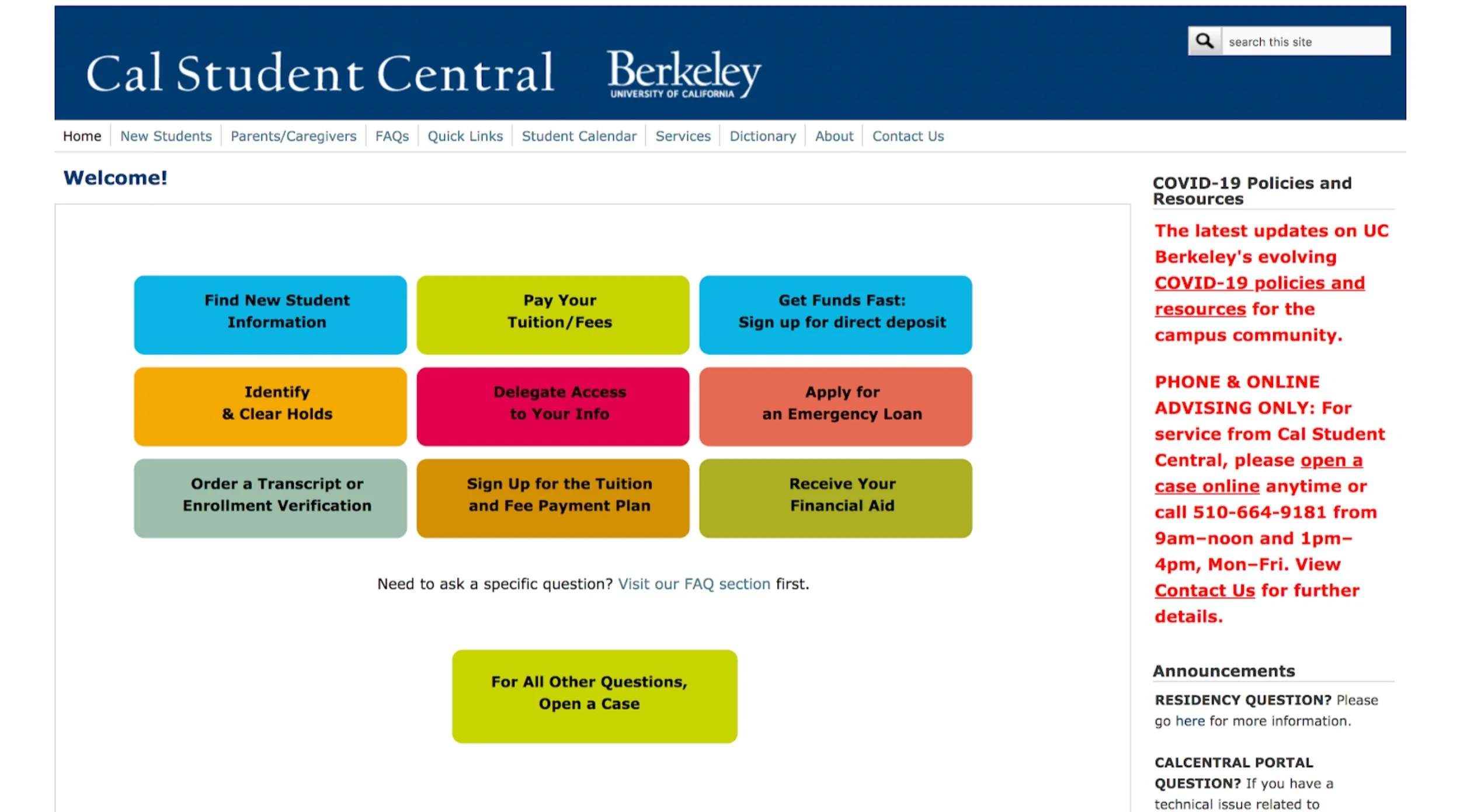
Homepage items are used before navigation items.
Finding dates and deadlines is unintuitive.
Pages are cluttered with text and overwhelm users.

Users visit the website only if told by advisors, rather than independently.
Communicating user research findings
After identifying users’ most common tasks and pain points, I came up with recommendations to alleviate each pain point.
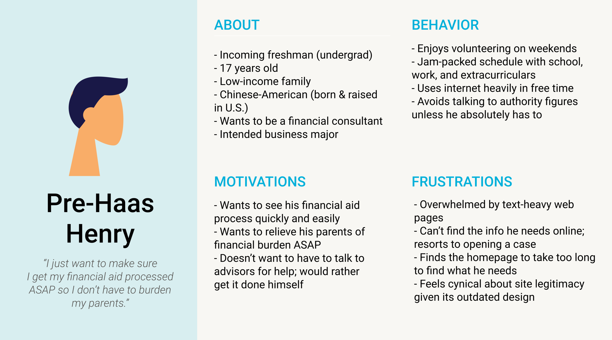
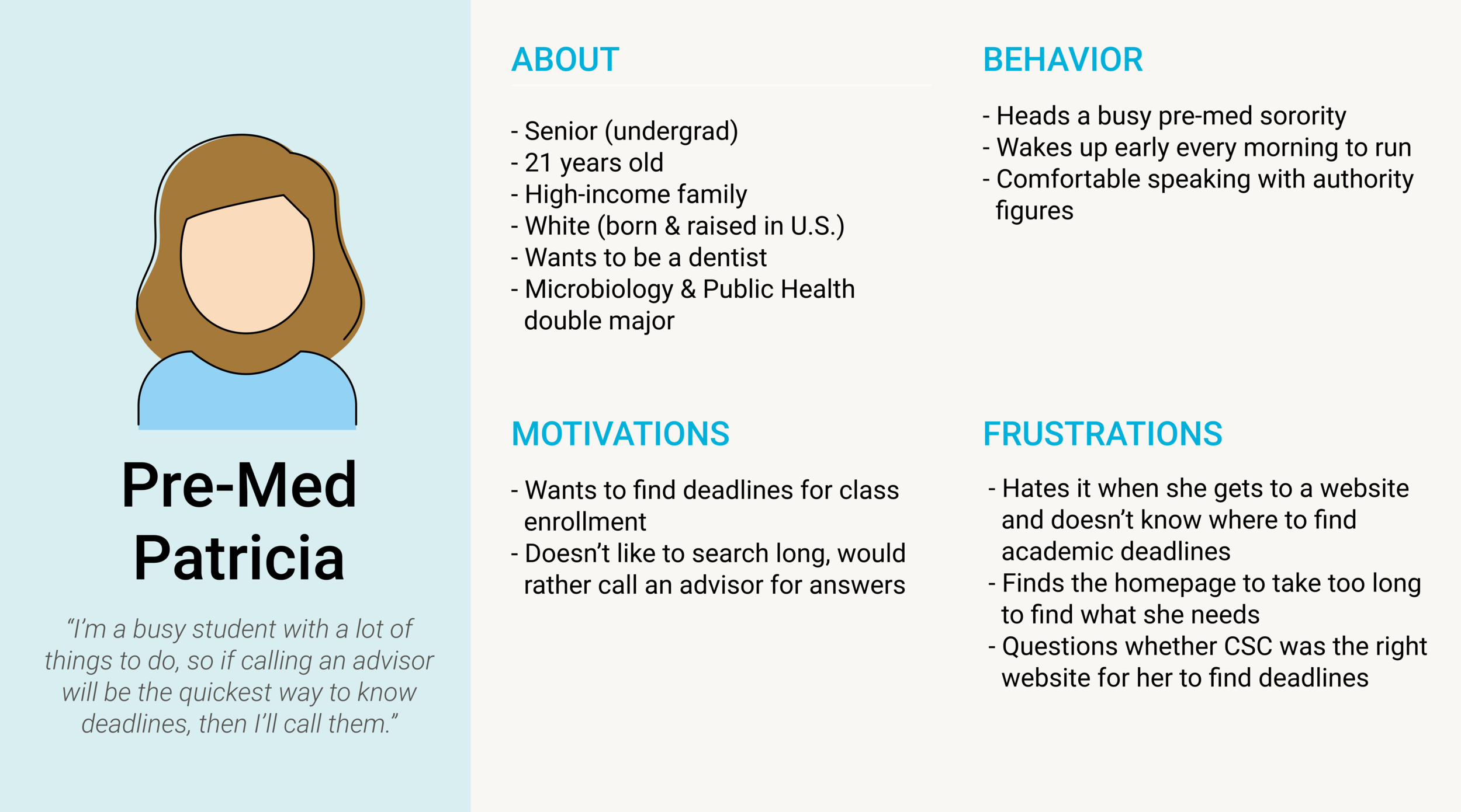
To communicate our users’ needs specifically, I created user persona profiles based on our insights from usability testing. These helped our content writer to understand the motivations, frustrations, and behavior of the primary students who would be reading their content.
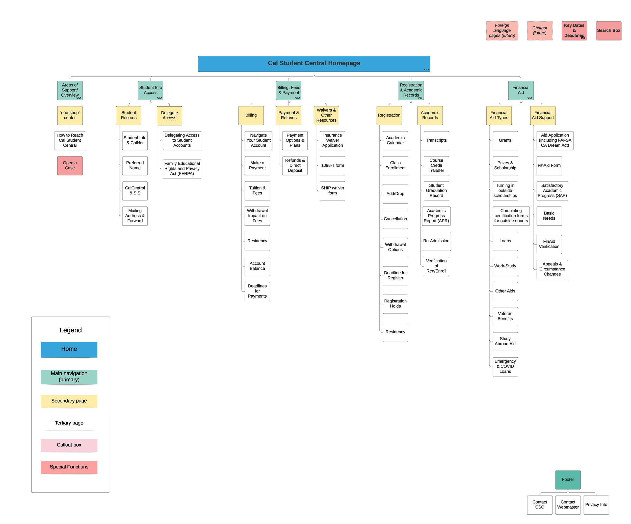
Restructuring the sitemap
To understand how our client wanted to restructure the sitemap, I audited each website function, created a task inventory, and categorized tasks by major topics. To learn how stakeholders would reorganize information, my product manager and I facilitated a remote hybrid-card sorting session with them using Lucidchart.
By asking stakeholders to rearrange the sitemap as they saw fit, we learned that their interpretations of many tasks were different from each other and needed to be clarified. Through clarifying task definitions and grouping similar ones, we reduced the number of tasks a user could consider from 158 to 71, a 45% decrease, allowing users to focus on primary site tasks.
Results
After applying recommendations from our user research to the website redesign, task efficiency increased by 45%, client satisfaction increased by 60%, and user satisfaction increased by 80%.
These metrics gave us confidence that users were able to navigate the website more efficiently without needing to open a case or call advisors, granting advisors bandwidth to focus on clients with more complex cases.
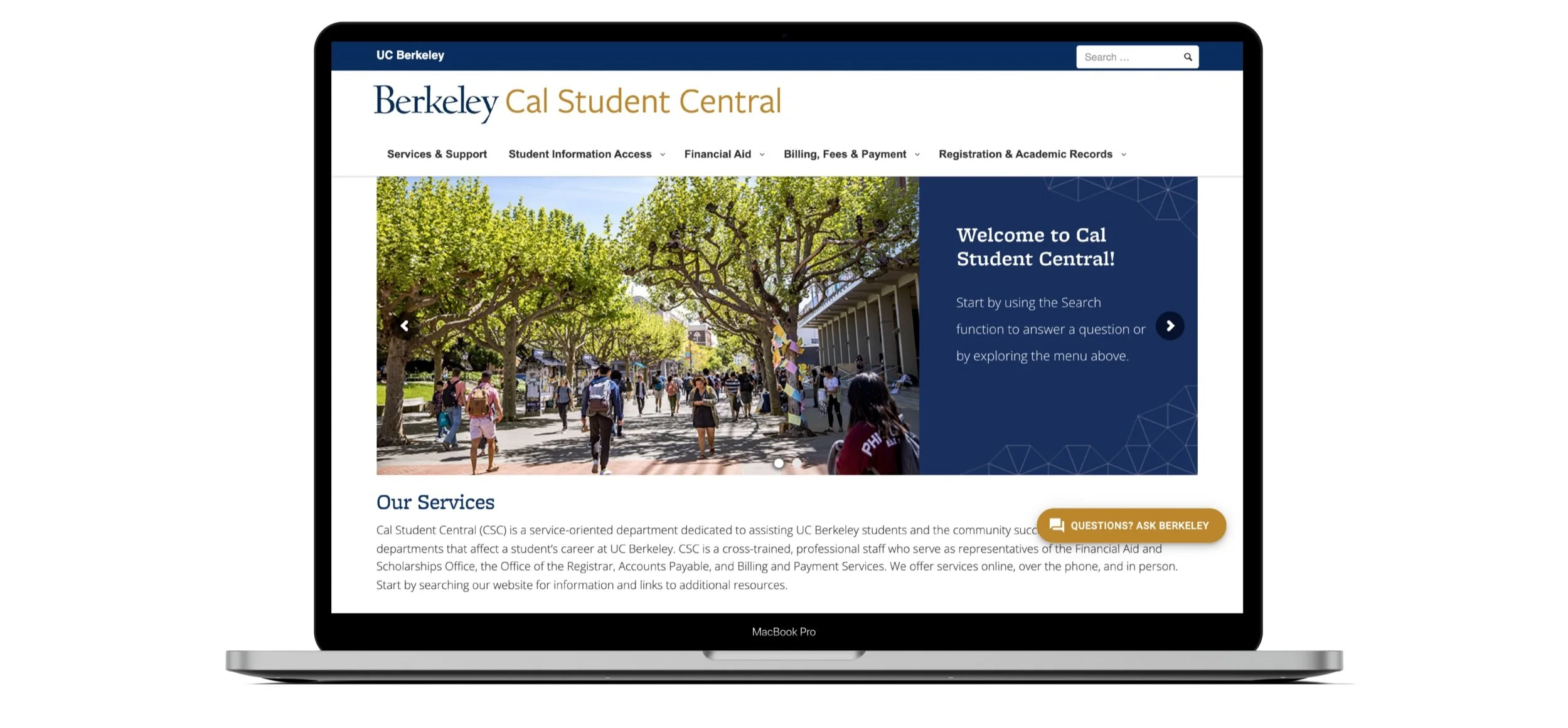
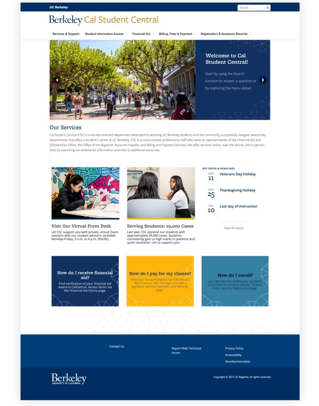
BEFORE VS AFTER
Reflections
Establish focused research goals from the start. Making it clear that my objective was to learn what pain points users were experiencing so that I could suggest data-driven improvements to the website allowed me to be focused as I conducted, analyzed, and shared my research with stakeholders.
Present research findings clearly and concisely. Designers and developers have tons of work to do and aren’t necessarily going to take their time digging through pages of a research report, so presenting a visually engaging slide deck was an effective way to share my learnings and recommendations, as well as allow them to interact with my research and ask questions.