Designing an interactive user search experience
COMPANY/TIMELINE
Tanium, 4 months (2021)
MY ROLE
Interaction design, prototyping, wireframing, competitive analysis, design systems
TEAM
Ryan Osterbeck (Director of Web), Jenna Kim (UX Designer)
TOOLS
Adobe XD, Microsoft PowerPoint, Asana
Overview
Tanium helps the world’s largest organizations to protect and manage their security networks. One of the main projects I worked on as a UX Design Intern was designing a user-centered search experience.
Problem
Although Tanium had an existing web search tool, the problem was that there was no user-centered approach to ensure that using it would be an intuitive and delightful experience to win over potential clients.
Strategizing research tactics
To learn what made search experiences effective on websites, I started by conducting secondary research and learned that there were several questions to consider.
Should our search filters and search bar be displayed horizontally, vertically, or change based on the device?
Should we filter search results interactively or in batches?
Should we limit users to selecting one item on a filter category or multiple?
Should we include sorting options or not?
Should we display the number of search results or not?
Although my initial research was informative, I realized I needed to understand more on how search tools were commonly designed.
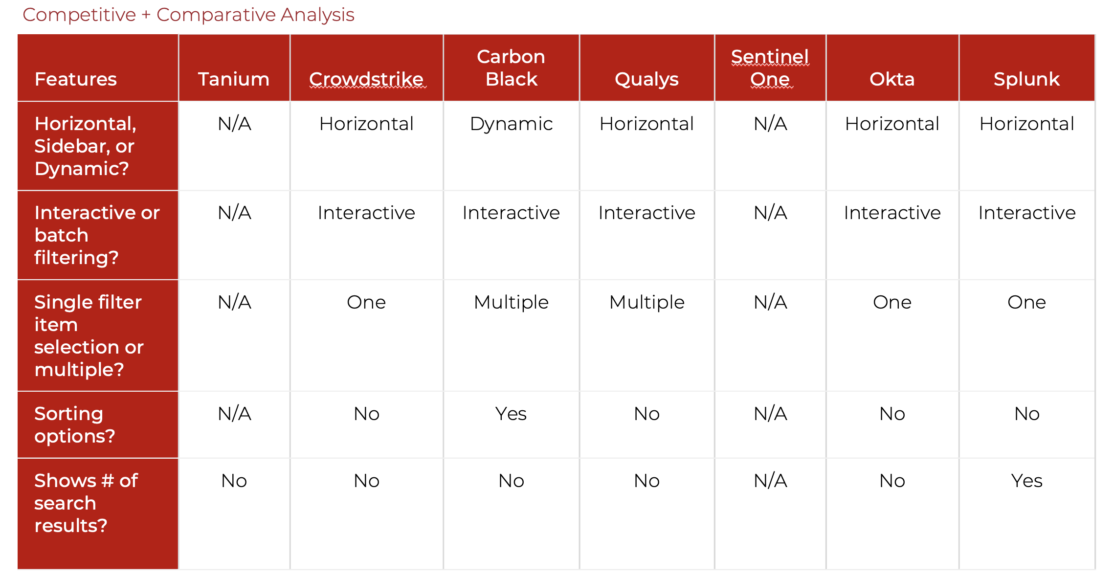
To learn from Tanium’s competitors and compare them with other company websites, I created a competitive matrix documenting each of the decisions they went with. This allowed me to make careful decisions with my design choices based on what users were already familiar with on websites for the computer and network security industry.
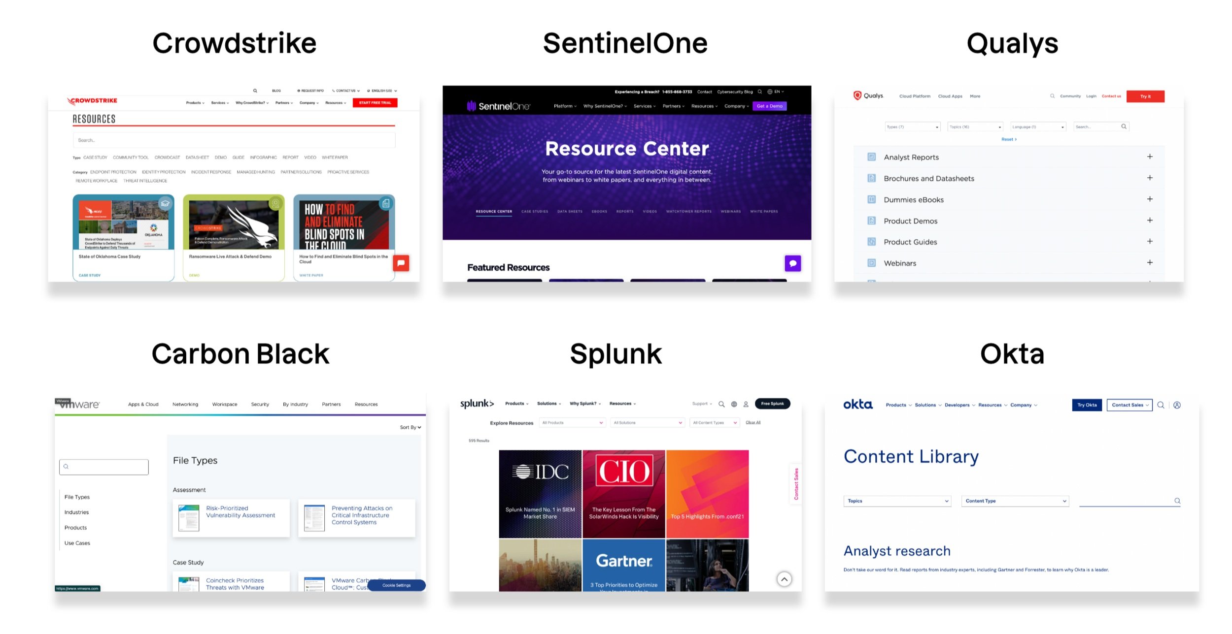
From my competitive analysis, I discovered key patterns:
Most competitors displayed their search tools horizontally, while many e-commerce sites tended to display theirs vertically.
All competitors displayed search results interactively rather than by batches.
There was no clear consensus on whether companies allowed users to select one filter item at a time or multiple.
Most competitors did not give users the option to sort search results beyond using filter selections.
No competitors displayed the number of search results.
Visualizing the options
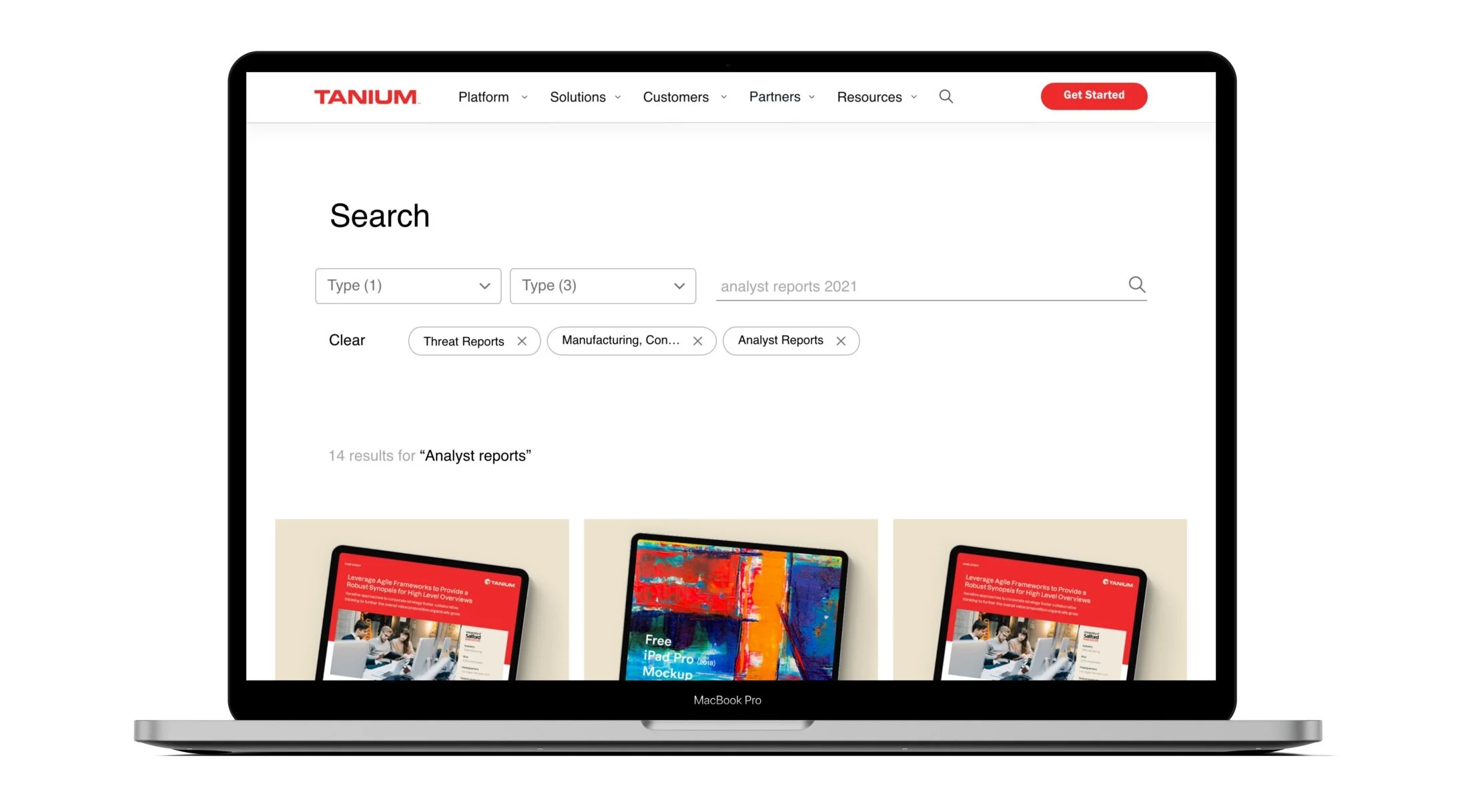
After thinking through best practices and design patterns across competitors, I realized that displaying Tanium’s search tools horizontally would be best due to the familiarity it provided for our users.
Taking heuristic evaluations and technical constraints in mind, I moved into designing search components. To explore possibilities with interactive features, I sketched out user flows on pen and paper.
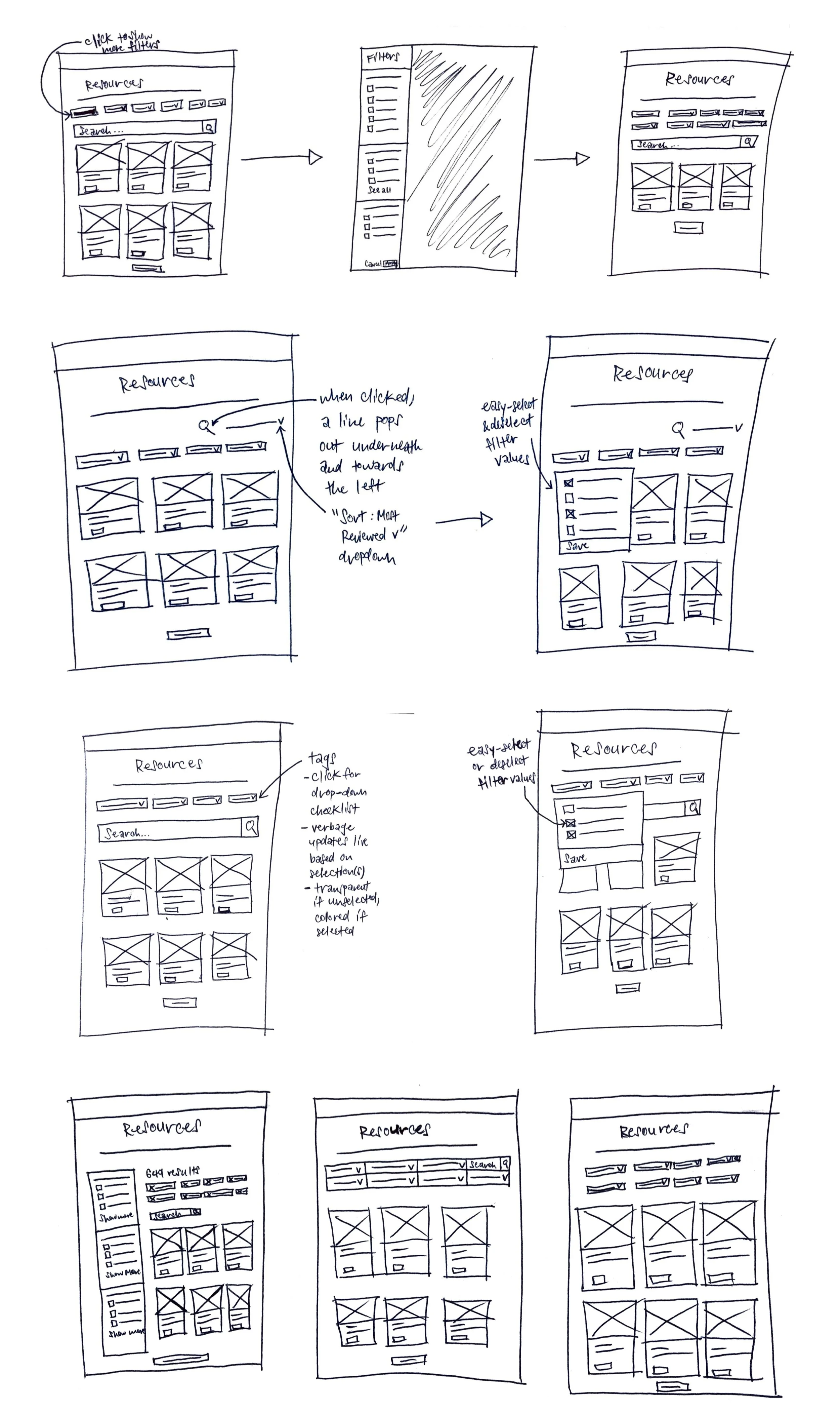
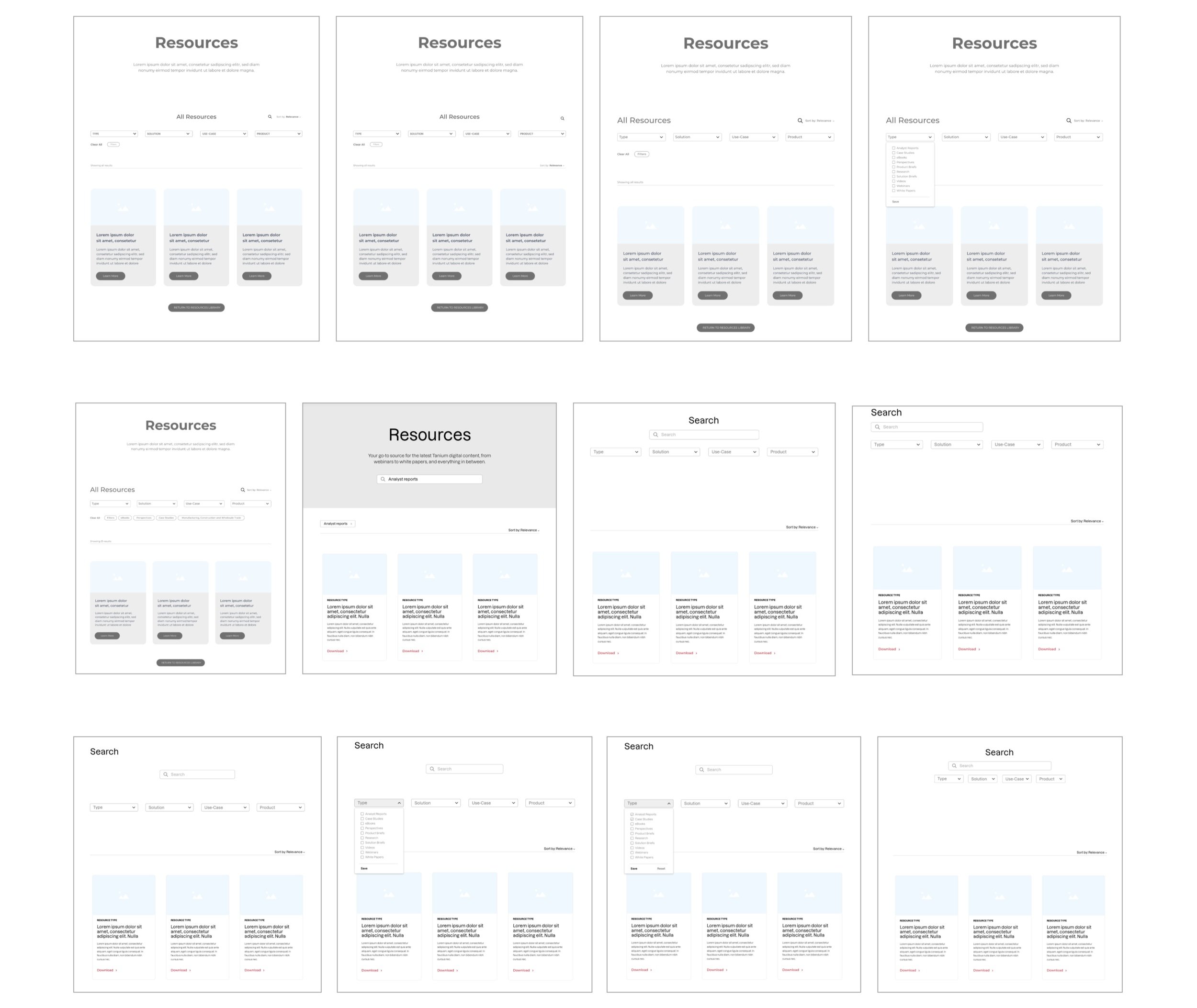
After receiving feedback from team members, I narrowed down options and moved into wireframing.
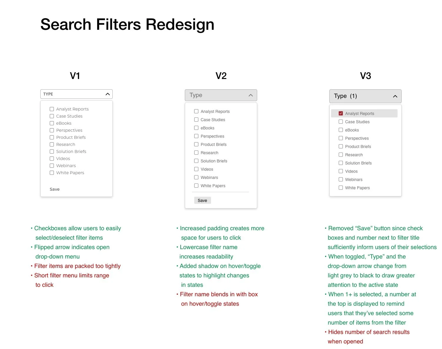
Iterating through feedback
As I designed each feature, I spoke regularly with team members and made improvements based on their feedback.

Thinking through interactions
To make the search experience as intuitive as possible for users, I had to think through each of the interactions, from drop-down menu items to filter tags. I designed an interactive prototype to visualize each interaction.
Multiple options per filter
For each search filter, I designed drop-down menus with clickable checkboxes, allowing users to select one or more items at a time.
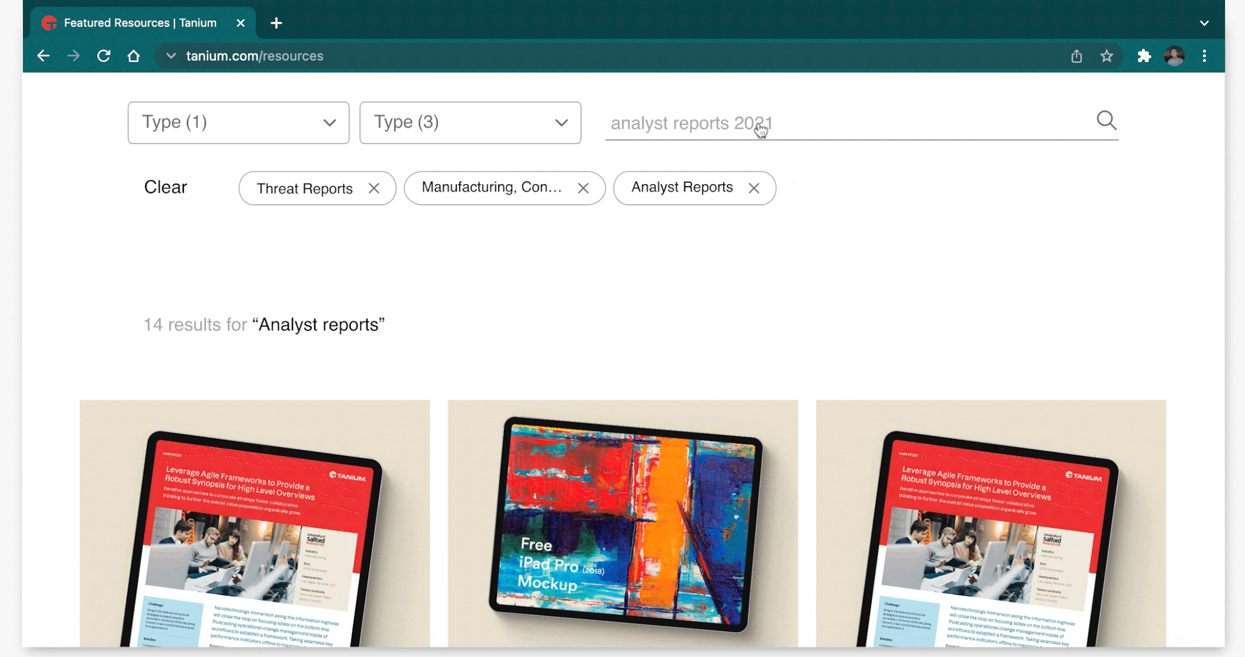
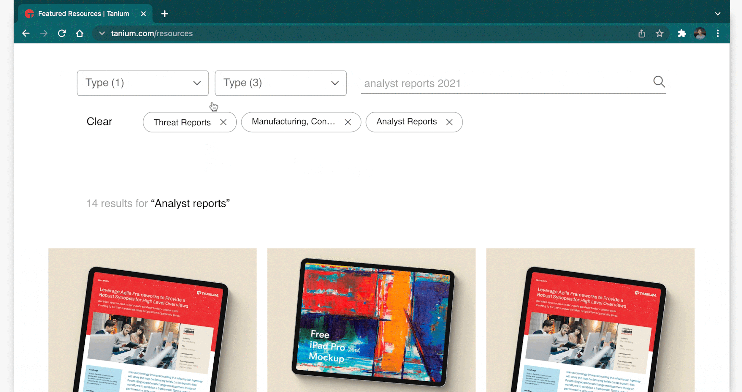
Open-text search field
Using the search bar allows users to find specific results tailored to their entries.
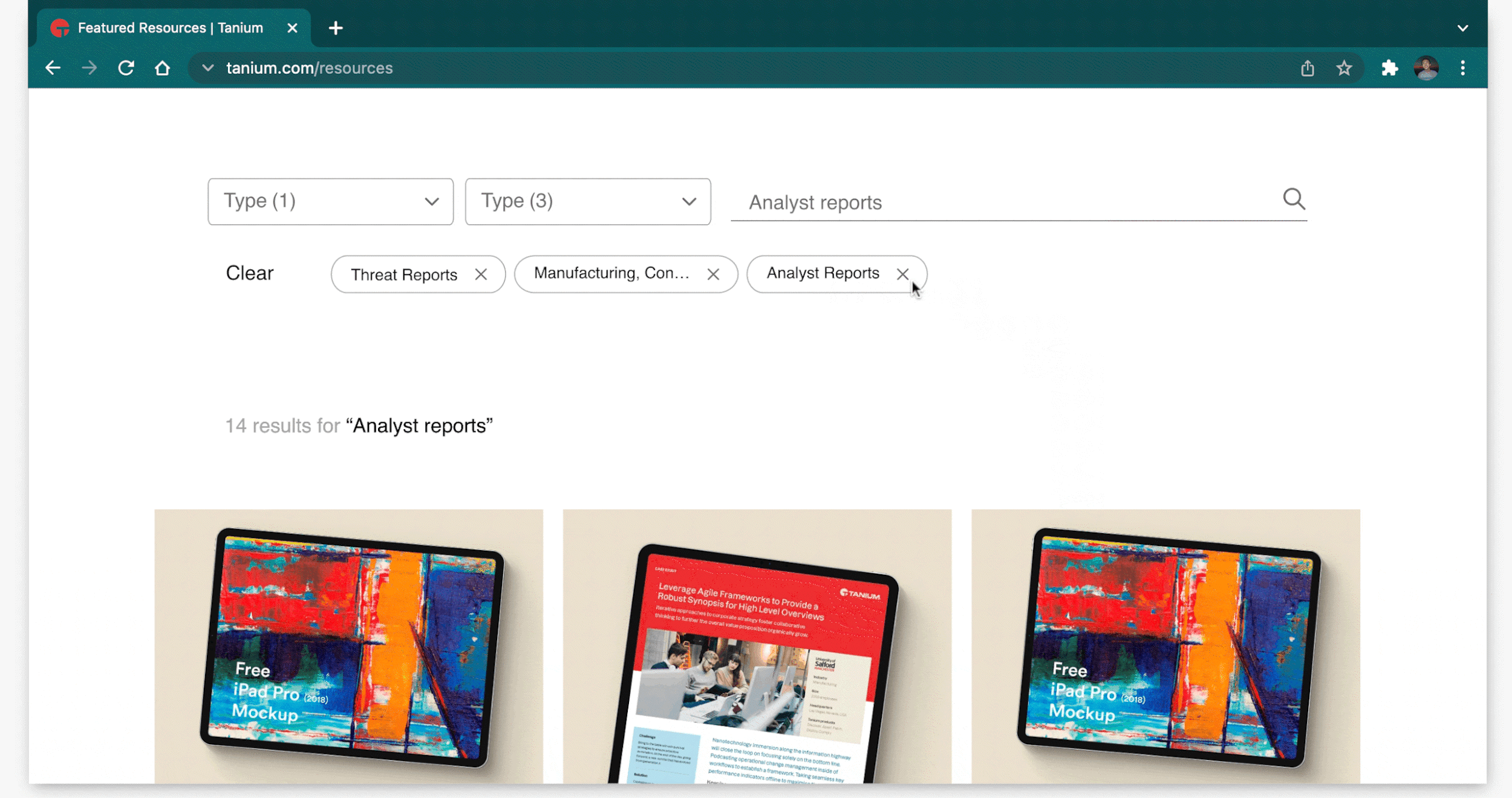
Easily removable filter tags
Displaying tags for each filter item a user selects allows them to remember what items they selected easily and remove them quickly.
Results
My designs were passed on to the development team before implementation on Tanium’s website. I’m grateful that as an intern, I was entrusted with the responsibility to design Tanium’s first user-centered search experience and create components for the company’s design system that would span across the entire website.
My hope is that potential customers will find the search experience intuitive to use so they can be further compelled to meet their business needs using Tanium’s products.
Reflections
Design with future use cases in mind. As I presented multiple iterations of the search prototypes, my team members challenged me to think through how my designs would scale in future possible scenarios. By designing a system not only for present use cases but also for potential ones, I realized that I could save future designers and developers a lot of time on their work.
Explore many design options before narrowing. At the start of this project, I did not expect there to be so many potential options for designing a search experience. However, through thinking through countless options, I learned how to justify my design decisions thoroughly to ensure they were not just good decisions, but actually the best ones relative to other possibilities.
DESIGN SYSTEMS
Transforming a UI pattern library into a design system
In the past, Tanium had always hired external design agencies to design its websites. However, because no one had ever created a design system, only a UI pattern library existed for internal designers and developers to reference, and it was a mess. To optimize workflows moving forward, Tanium wanted to design things internally and establish a formal design system.
I worked with one UX designer to audit components, organize them, and build Tanium’s first-ever design system.
Auditing the problem
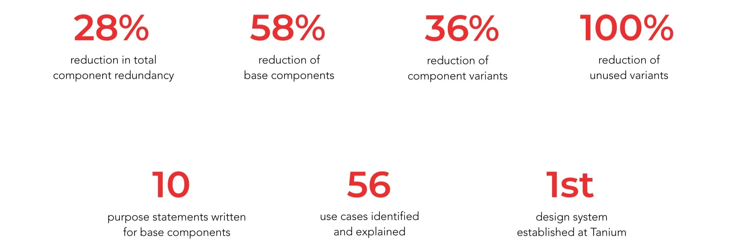
After conducting an audit for Tanium’s UI components, we discovered that there were 24 base components, 88 variants, 22 unused variants, and only 19 variants that were used 10 or more times. To organize our component library, we decided to merge components that were similar.
After consulting developers, we realized that only 42% of existing components and 64% of variants were needed. This allowed us to remove all unused variants and decrease the total number of component options, streamlining communication between designers and developers and reducing component redundancy by 28%.
Learning from research
To transform our pattern library into a design system, we started by researching successful design systems such as Google Material and Zendesk Garden.
Research showed us that in order to be intentional with every component we kept, we needed to define its purpose clearly. This drove us to write brief purpose statements for each component. After noticing how successful design systems did a great job at explaining every scenario in which the component could be used, we decided that documenting use cases for each component was also necessary.
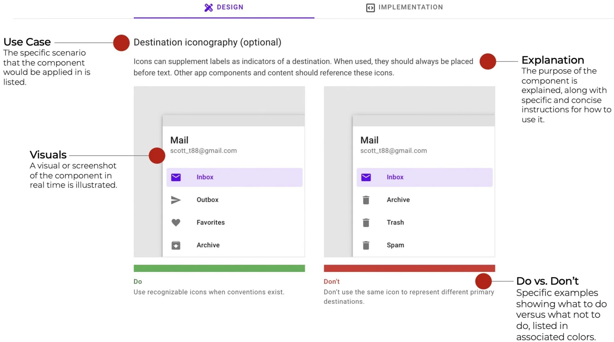
Moving forward
Moving forward, we saw that we needed to annotate components thoroughly so that developers could understand each component well and know exactly how to implement it without needing to ask designers for help.
Since one UX designer was needed to start redesigning Tanium’s resources page and building out components for the search function, I moved over to another project while the UX designer I worked with annotated components and prepared to create new ones.
Results
Through my design process with the UX Designer I worked with on Tanium’s design system, I can proudly present the following numbers to help illustrate what we accomplished:
Reflections
Every software product should have a design system. Through auditing Tanium’s UI pattern library, I learned how cluttered components can become over time and reduce workflow efficiency for teams. By establishing a design system, I’ve witnessed first-hand how companies can make their teams far more productive.