Simplifying the search for mental health resources

TIMELINE
3 months (2020)
MY ROLE
Interaction design, mobile app design, prototyping, user flows, wireframing, customer journey mapping, user testing
TEAM
Vianna Quenon, Avery Wang, Connie Lam
TOOLS
Figma, Miro, Google Slides
Overview
In a human-centered design project at UC Berkeley, I worked with 3 teammates to streamline the process of finding mental health resources for busy young working professionals. Our team worked in 4 agile sprints: Identify, Understand, Conceptualize, and Realize.
Problem
For busy young working professionals, finding ways to manage mental health is often challenging. With countless digital resources on the market, many do not know where to start and feel overwhelmed by the thought of trying to search for one.
Goal
Our goal was to make identifying the right kind of resources for each person easy.

Discovering through research
To learn about the mental health resource space, we investigated popular services that people use to find resources. While many resources were available, we wanted to learn if people actually accessed them and why. To learn more, we surveyed and conducted interviews with young working professionals across industries. We discovered 3 key insights:
Heavy demands and busy schedules often led to stress, anxiety, and other mental health issues
Users felt that searching for resources would be too time-consuming
Users wanted long-term treatment and solutions to managing their stress
Identifying user needs
Based on our research, we created 2 personas to identify different types of users and their needs.


Based on our persona “Overwhelmed Ollie”, we created a user journey map to identify key pain points and opportunities for improvement.

To compare mental health resource services across the market, we conducted desktop research and competitive analysis.

We discovered that users can shorten their search through websites with filters that can match users to a therapist. However, they only suggest professional treatment options and rely on the user to know when to seek treatment and identify their issues specifically. This showed us that there was a gap when it came to the process of finding resources.
Brainstorming solutions
After synthesizing our user research, we decided that we wanted to create a solution that would improve the process of finding mental health resources. Using key findings, we created a list of 3 key requirements our solution would need to have. These provided a framework for us to brainstorm solutions.
Clarifies care options to help users make an informed choice on the resource that would address their needs the most
Streamlines the process of finding the right resource
Gives users high autonomy to identify mental health resources fit for them
We brainstormed solutions using design methods including design heuristics, visual brainstorming, and sketching. After generating concepts, we looked for convergence in our ideas and narrowed down our concepts. To help us choose our final concept, we asked users for feedback. Since users found that our app concept translated health data insights into actionable resource recommendations, we decided to move forward with our final concept, an app that uses health data tracked by smartwatches to recommend personalized mental health resources for users.


Designing and testing
We designed quick sketches and wireframes to visualize our final app concept. We met with users again to conduct usability testing, which provided us with more research insights to apply for our clickable prototype. For example, since users needed more clarity to indicate what buttons could be tapped, we increased color contrasts between clickable and non-clickable elements.


After iterating through several rounds of interface sketches and user critique, we developed a user flow diagram to create a stronger framework for our prototype.

Using our user flow diagram and user testing insights on our wireframes, we iterated on our designs to create more thorough mid-fidelity mockups.

Moving into the high-fidelity stage of our prototype, we created a style guide to make sure our colors and typography were consistent and intentional. We chose 2 colors for our main color scheme: yellow because it symbolizes peace, and lavender because it’s commonly associated with relaxation. For our typeface, we chose Poppins due its rounded, sans-serif style, which we saw created a modern and familiar look for users.

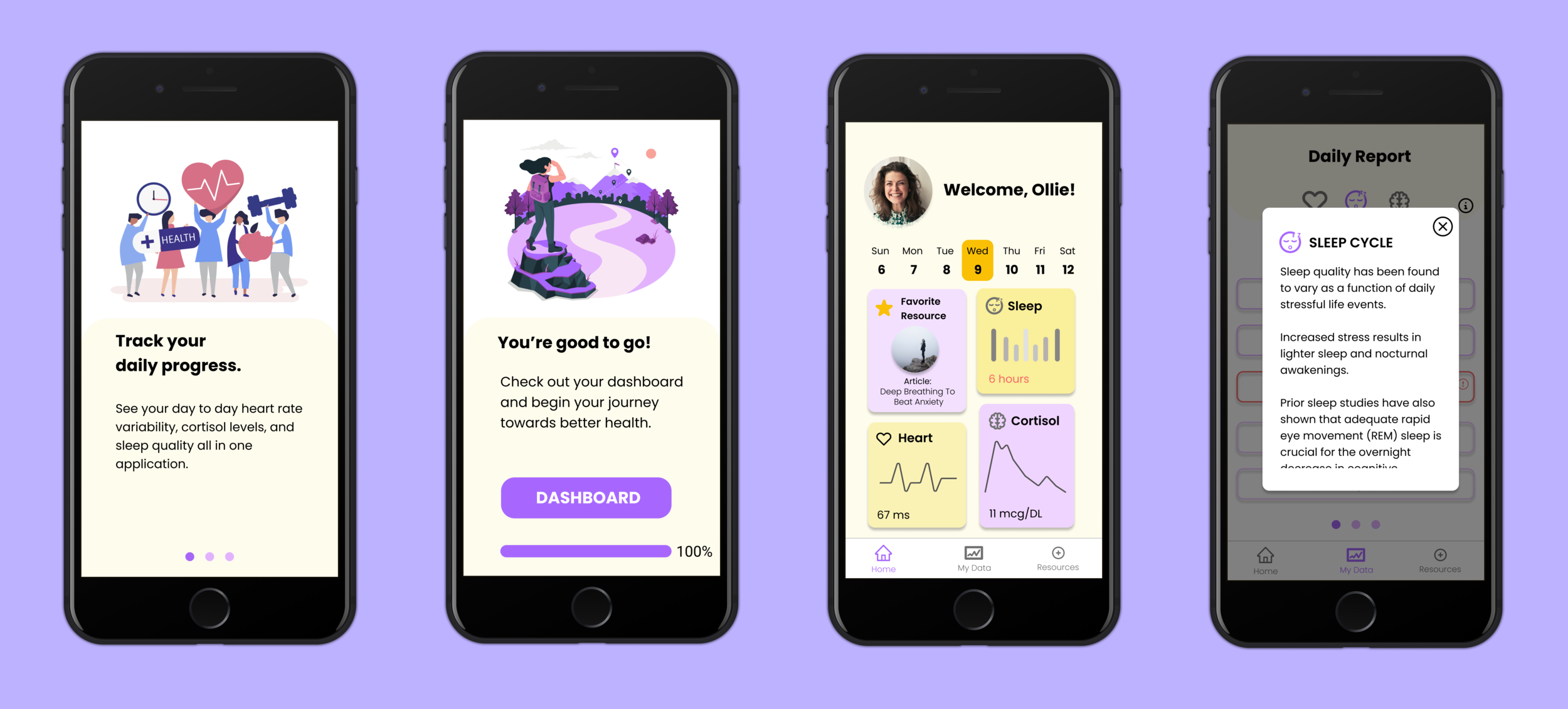
To meet user needs through fulfilling our product requirements, we had to think through all the interactions users would have, from onboarding to seeing resource recommendations. Below are key features visualized from our high-fidelity, interactive prototype.
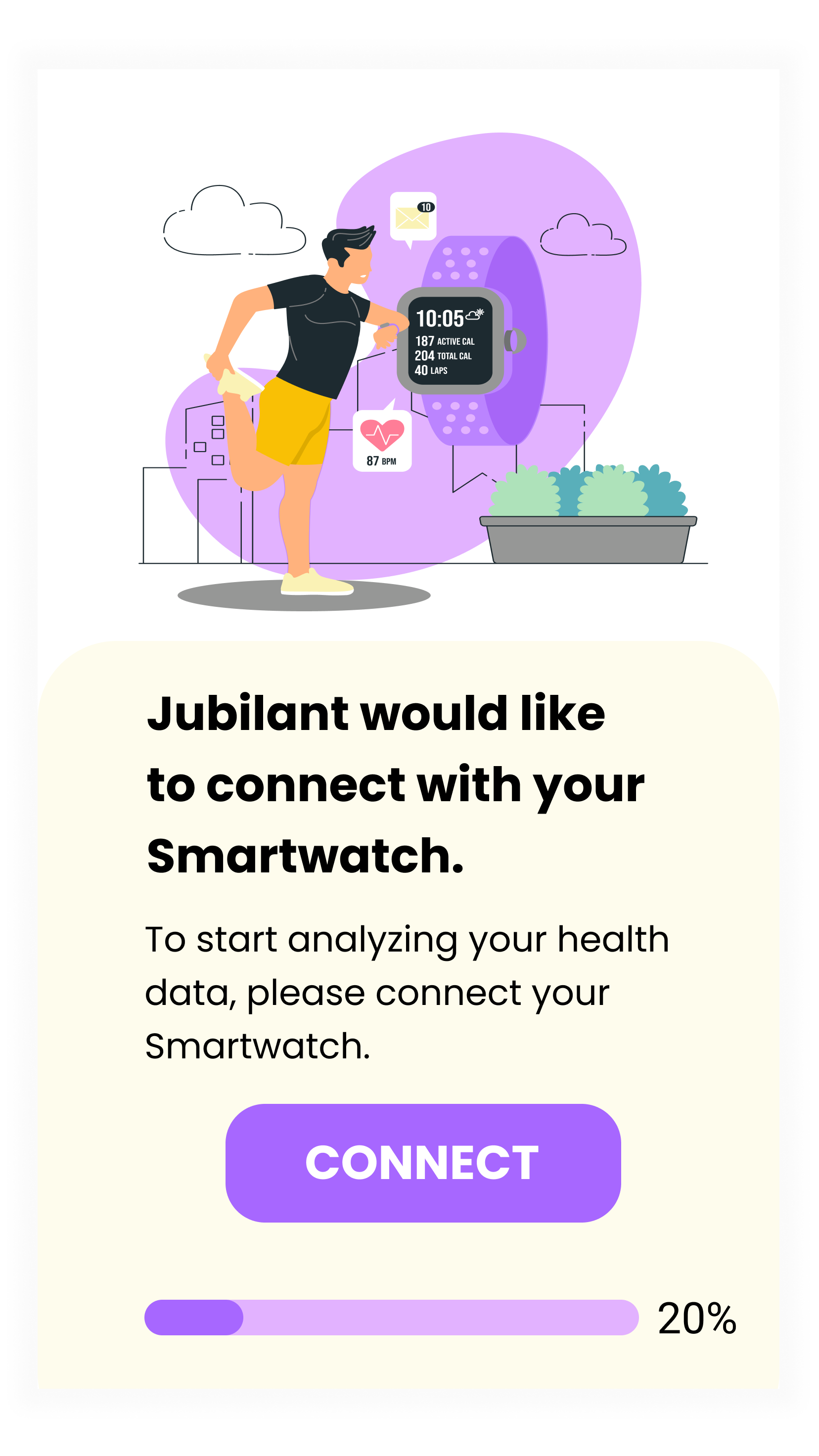
Onboarding
Quickly connects to a user’s smartwatch and takes in pre-existing user data to further personalize recommendations.

Health Data Reports
Daily reports making health data easier to understand. Users are prompted to notice major changes in their health levels to reflect on whether they may have experienced greater stress and why.


Resource Recommendations
A small selection of resources are displayed for users to view without being overwhelmed by endless options. Brief explanations of each resource pop up upon tapping the resource, allowing users to briefly learn about a resource and decide if they’d like to try it.


Conclusion
After designing our high-fidelity prototype, we conducted another round of usability testing with users. Based on what we learned from them, we discovered that visualizing health data with trends and graphs would help users understand their health data faster. We also learned that to allow users to keep track of the recommended resources they’d like to consider for future use, adding an featured titled “Archived” or “Collection” might be helpful.
Moving forward, I plan to iterate on our latest user testing insights with my team to make our prototype more intuitive and streamlined for users.
Reflections
User testing is key to success. Through seeking feedback from users after designing wireframes and once again after creating our high-fidelity prototype, I discovered ways we could improve our product that I wouldn’t have if I just kept to myself.
Clarify product goals. By making it clear what we wanted our product to achieve, we were able to stay focused as we brainstormed features rather than get side-tracked in non-essential details.